I was part of the team that designs and builds the core listening and watching experience used across all BBC products and devices.
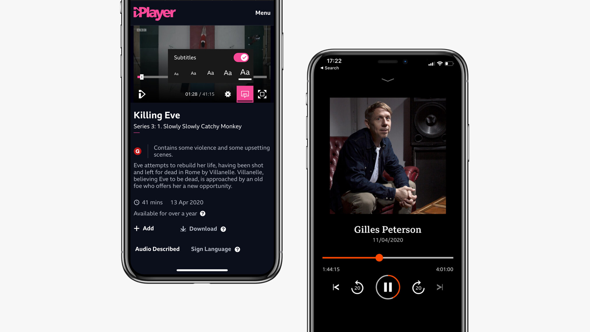
I led a project to update the experience and user interface of the native app video watching experience to enhance usability and accessibility.
My role: user and competitor research, visual and interaction design, icon design, prototyping, user testing, motion design. I worked with 2 other designers, a researcher, and a team of developers in London and Salford
01_Understanding the opportunity
02_Discovery: user & competitor research
03_Defining the user need: personas & user flows
04_Developing the product: ideation, testing & iteration

01. Understanding the opportunity
The team was aware that the BBC’s video and audio player usability and UI was in need of an update. There were also inconsistencies across app and web, and players used by different BBC products, causing design and engineering inefficiencies and accessibility concerns. We set out to update the design and the build of the player to be more usable and accessible, and ultimately increase consumption - especially on the BBC’s native apps.
Another key aim was to make the player more flexible to the needs of different BBC products, for example short format content on BBC News or BBC Sounds had very different requirements to long format content on BBC iPlayer.
02. Discovery
User research
In the early stages of the project we leant on previous research done by the iPlayer team and third parties, as well as App store reviews to kickstart the project as quickly as possible. There were clear usability and accessibility problems that we were aware of and we wanted to invest research budget in the latter stages of this project.
Key findings were that users were:
- confusing the volume “scrubber” controls with the time scrubbing functionality;
- accidentally hitting the scrub bar when they were trying to play/pause as the controls were small and close together;
- finding it hard to use the scrub bar on touch devices - difficult to navigate to a granular time;
- often confused by the subtitle icon and “more” functionality (which shows other episodes and similar content);
- not aware of “casting” options to share content on their tv/speakers (airplay and chromecast icons weren’t familiar).
In addition we were aware that the screen reader experience was mixed (especially on web) and that subtitles sometimes clashed with the core controls, and sometimes even important content (such as sports scores).

Some of the usability problems we were aware of in the mobile player experience
Competitor research
We looked at competitors across audio and video products to see what they were doing well, and what could be improved on. Our main findings were that:
- many of the BBC’s competitors were leaning towards a mobile first UI (unlike the BBC who had by and large ported over their web approach);
- controls were by and large the same across Android, iOS and web;
- competitors were starting to introduce more advanced navigation mechanisms (especially audio players) to skip forward or back by 5 to 15 seconds to make navigation easier;
- there was an opportunity around onward journeys as competitors had a limited offering.
Ergonomics & touch
We looked into ergonomic research to help us design the most ergonomic and touch friendly approach for our users, looking at the work of Steve Hoober (the author of the commonly used thumb reach diagrams) and Luke Wroblewski.
The research (confirmed by our subsequent user testing) found that users preferred more central positioning of controls and that that this also increased accuracy. The research also helped refine an approach for larger tablet devices which are often used in a very different way to mobile. E.g. tablets are more likely to be used at home, seated, and also shared between users - which meant that they’re often propped up or in a holder - which can influence the best positioning of controls.
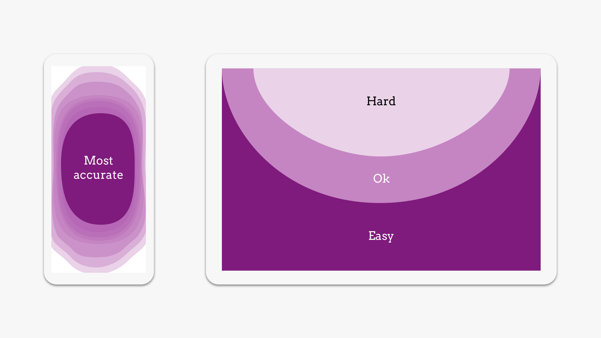
Accuracy and ergonomic research which informed our designs
Gathering data
We gathered data around the use of the various controls used in the audio and video players (play, pause, scrub bar, subtitles, casting, volume, more content). We wanted to see if there was anything we could learn from their use. We also had some limited data around failed taps - users tapping the area around a button.
Two of the most interesting findings were that failed taps around play and pause were frequent (aligning with feedback we’d received from users), and scrub bar usage was very high throughout content, but particularly at the beginning. We were interested to see if that could also be users accidentally tapping the scrub bar, and/or perhaps skipping over the intro credits. Either way we could see that it was used frequently to navigate, even though we knew that it wasn’t a great experience on touch devices.

Data showing the use of the scrub bar, particularly at the beginning of content
03. Defining the user need
Personas & experience mapping
At the BBC we use a variety of personas across different products. Because our product (the audio and video experience) sits across almost all BBC products we gathered the other teams’ personas to understand their requirements. And then pulled together 5 loose proto personas to help us understand these varied needs and how we could best design in a flexible way for all BBC products.
For example some users may use a variety of BBC products, expectations and needs different when they’re watching news vs. if they are watching longer format on iPlayer, or even if they are watching something as a family. We used the proto personas to guide our ideation sessions.
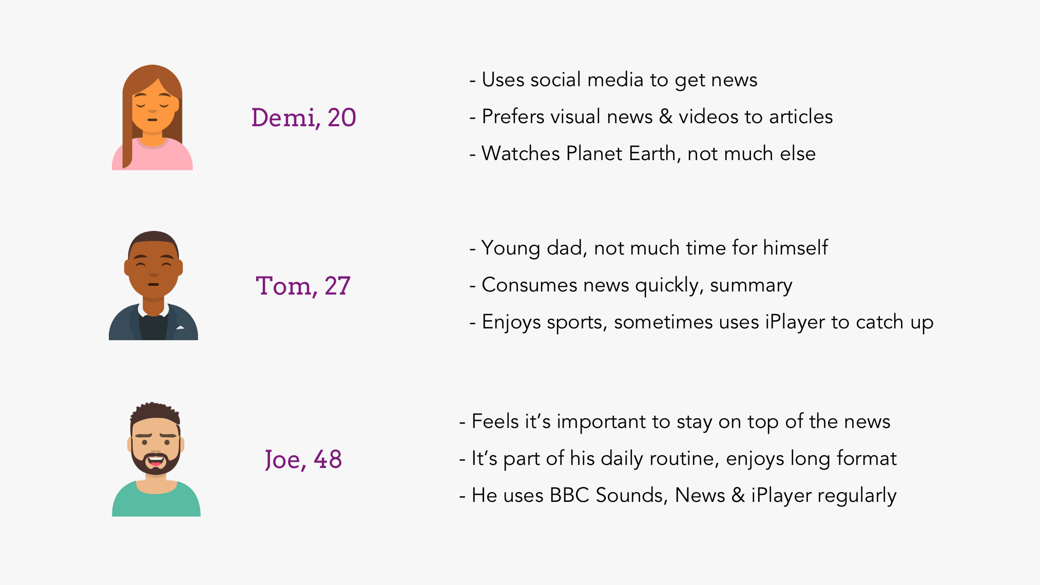
Some of the BBC proto personas we used to help guide our ideation sessions
04. Developing the product
Ideation
We organised a number different ideation sessions with our team and other designers and developers across the BBC. We focused around 5 main problems as “How might we” statements:
- How might we create a really easy to use core navigation system (play, pause, forward, back, volume);
- How might we offer up interesting and useful content to users after they’ve finished watching/listening;
- How might we improve accessibility and ensure the best experience for all our users;
- How might we improve awareness of various casting options;
- How might we improve the subtitle experience.

One of the ideation sessions we ran, this one with the BBC News design team
Prototyping & user testing
Based on the designs developed in and following our ideation sessions we built out prototypes, first in Invision and Principle, and later in code for user testing. We ran multiple rounds of testing (amongst colleagues, guerrilla testing, and lab testing) where we assessed:
- how users perceived and used centralised controls;
- what location was best (comfortable, accurate) for the majority of users;
- how a skip forward/back interaction would be used, and what time interval was most useful (e.g. 10s vs. 15s etc);
- how different iconography performed/how intuitive it was;
- how the experience would work for portrait mode and when space is limited (News have small portrait players).
The new designs performed really well, with all but 1 participant preferring the new approach and reporting that they found it easier to use. We also got valuable feedback around the exact positioning and function of the controls, the iconography, and other gestures and controls we explored to add more delight to the video watching experience.
Later in the project we organised testing with deaf users as we wanted to ensure that the new controls didn’t impact the experience for subtitle users. The design performed really well and users preferred it to the existing design, and found it easier to use. The subtitle users that we tested with found that the controls were less in the way and were pleased that the subtitles didn’t need to move around as much.

A summary of our user testing findings
Iteration
The last 3 months of the project focused on the early stages of the build, and iterating based on feedback from user testing. Our MVP focused on the core player functionality, and then we slowly worked on the iconography and tweaks to accessibility (including our subtitles UI).
We also started to work on “nice to have” functionality including haptics and motion design. We were keen to apply the latest technology in haptics as this can help users with low mobility and vision (as an extra form of feedback). I also led a project working with external motion designers, to take the animations that we’d made in Principle and develop an animation language for the BBC’s video and audio players.
This work can now be seen across all of the BBCs video players - from BBC News, CBebbies and the Sounds App.